
Looking For An Alternative To The Arri Alexa? These 3 Cinema Cameras Have You Covered At A Lower Cost
I don’t think I’ve met a single filmmaker in recent years who hasn’t marvelled over the Arri Alexa. Even with so much competition in the digital cinema camera market, there is no denying that the Arri Alexa is still without a doubt the camera to beat. In many ways, the Alexa look has even replaced film with regards to the base-line aesthetic that most of today’s filmmakers strive for. I’ve outlined this sentiment in more detail on a previous blog post here.
What makes it so great though? For a long time people chocked it up to dynamic range. When the Alexa was first introduced, very few cameras delivered anywhere near the DR that the Alexa was capable of. But today, there are many cameras that have dynamic range capabilities that are at least within arms reach of the Alexa – yet still none of them look as good.
The reason why is simple: Color science. In my opinion, color matters more than anything else when it comes to the visual perception of a cinematic image. Resolution, dynamic range, grain, motion cadence, and many other factors play an important role too… But color science is at the very top of that list. A camera with less dynamic range but better color science will look more “filmic” than a camera with high dynamic range and poor color science. I believe that many of Sony’s recent offerings prove this point clearly.
Unfortunately for the vast majority of independent filmmakers, the Alexa is simply a far too expensive tool to own. Even Arri’s lowest cost offerings (such as the Alexa Mini and Amira), will cost anywhere from $35K – $45K as base price, and will jump up significantly once the accessories are added. Inevitably, this has led many low budget filmmakers into a desperate search for affordable Alexa alternatives that can deliver similar image quality at a lower cost.
It’s worth stating up front that the only way to get the exact “Alexa-look” that you may be after is to actually shoot on an Arri Alexa (or Arri Amira). That said, a few select cameras in recent years have come reasonably close to emulating the Alexa’s legendary image quality, and should be considered as viable alternatives for filmmakers that don’t want to break the bank.
Below is a short list of three cameras that in my opinion render colors and images that are most similar to the Arri Alexa. Keep in mind, the list below doesn’t necessarily reflect usability, features/specs, ergonomics, reliability, and many other considerations. Rather, these cameras have been chosen based on the characteristics of their image quality – specifically color quality – and how strongly they hold up next to the Alexa.
Here we go. In order of most expensive to least:
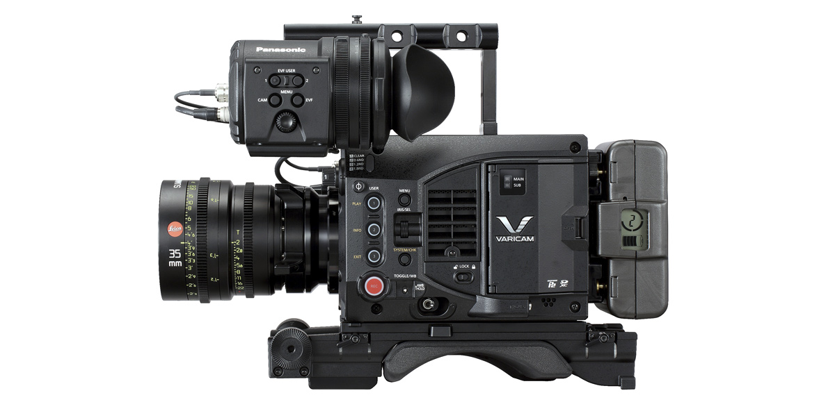
PANASONIC VARICAM LT – $16,500
With a price tag of over $16K for the body, or over $27K once fully accessorized, the Varicam LT clearly makes for a pricey investment. Even still, at minimum it will be 2 – 3 x less expensive than a brand Arri Alexa, depending on how each camera is configured. Not to mention, as a rental item, the LT is going to cost far less than the Alexa and will generally be much more accessible to lower budget filmmakers.
Let’s take a look at some of the specs:
- Single Super 35mm MOS Sensor
- Interchangeable Stainless Steel EF Mount
- Dual Native ISO 800/5000
- 14 Stops of Dynamic Range with V-Log
- 4K Up to 60 fps, 2K/HD Up to 240 fps
- Simultaneous Dual Codec Recording
- Selectable Gamma Curves
- Removable IR Cut Filter
- AVC-Intra, ProRes
- 3.5″ LCD Control Panel
Obviously, this camera boasts some incredibly powerful features, namely it’s dual native ISO capabilities which allow users to choose between ISO 800 or ISO 5000 as their base. But most importantly, the subjective image quality of the LT is absolutely incredible, and is arguably one of the best out there today.
Panasonic Varicam LT – $16,500 at B & H
The Varicam LT shares the same sensor as it’s bigger brother (the Varicam 35), which has been used to shoot some really gorgeous looking content – including the Netflix original series “Master of None”. Both cameras not only feature beautiful dynamic range capabilities that allow them to create detailed, rich images, but they also render extremely organic colors. This is what ultimately helps them achieve that Alexa look above all else. While footage from the Varicam LT might not be an exact match for Alexa footage straight off of the cards, the files are very flexible in post, and once graded they can easily hold their own.
CANON C300 MK II – $11,999
I’ve had a love/hate relationship with Canon for a long time, and presently don’t own any of their cinema cameras. With that in mind, I can’t deny that the Canon C300 MK II excels in the color department, which is really no surprise. Over the years, Canon have fallen by the wayside as other manufacturers have run laps around them with higher frame rates, more resolution, and better overall specs, but Canon has always delivered some of the best colors out there, which is largely why they are still relevant.
Before we go on, here are some specs on the C300 MK II:
- Super 35mm CMOS Sensor
- 4K,1920×1080 60/50i, 23.98/25p True 24p
- Canon XF AVC H.264 Codec
- EF Lens Mount
- Dual Pixel CMOS AF Technology
- Rotating 4″ LCD Monitor
- 2x 3G-SDI Output, 2x XLR Inputs
- 2x CFast Card Slots
- Timecode I/O, Genlock In & Sync Out
- Canon Log 2 Gamma
Canon’s C-series cameras have a long history of under promising and over delivering. Their cameras never look great on paper, but they always seem to deliver really strong images that far exceed what you might expect of them based on their spec sheets alone. Canon have also been accused of overpricing their cameras (I’m sure I’ve called them out on that myself), but with the recent $4000 price drop, the C300 Mark II is now more accessible than ever. And while their colors might not always look Alexa-like right out of the box, Canon has a new trick up their sleeves –
The C300 MK II now comes with a “Production” camera profile that is designed to mimic the color science of the Arri Alexa. When combined with Arri’s Rec. 709 conversion LUT in post, the resulting images between the two cameras are almost too close to call the difference on. For this reason, the C300 MK II is often used as a B-Camera to the Arri Alexa or simply as a cost-effective alternative for the A-camera.

Canon C300 Mark II – $11,999 at B & H
For those of you that don’t think you can achieve great narrative results on the C300 MK II, I’ll remind you that the 2013 Cannes Palm D’or winner (Blue Is The Warmest Color), was shot on the original Canon C300.
BLACKMAGIC CINEMA CAMERA 2.5K – $1995
By far the best bargain on this list, the original Blackmagic Cinema Camera was hailed as the “Alexa Mini” when it was first released, and for good reason. Although the ergonomics, build, and overall design of the BMCC couldn’t be more different than the Alexa, the overall image quality is amongst one of the best matches to the Alexa to this day. The subtle colors, high dynamic range, and natural texture of the BMCC’s images are just a few of the reasons why this camera disrupted the cinema camera industry in such a dramatic way.
Here are the specs:
- 2.5K Image Sensor
- 12-bit RAW, ProRes, and DNxHD Formats
- 13 Stops of Dynamic Range
- 23.98, 24, 25, 29.97, 30p Frame Rates
- Canon EF Lens Mount
- LCD Touchscreen with Metadata Entry
- SDI Video Output and Thunderbolt Port
- Mic/Line Audio Inputs
- Records to Removable SSD Drives
- Includes DaVinci Resolve and UltraScope
The fact that the original BMCC even shot at 2.5K (very close to the older Alexa model’s 2.7K ARRIRAW capabilities), made it even more compatible with the Alexa as a B-cam or C-cam. But as I stated above, the most important consideration here is the color science, and the 2.5K BMCC has some of the strongest color science I have seen on any camera to date. I am a big fan of Blackmagic and currently shoot on their URSA Mini 4.6K (also a fantastic camera), but it has a distinctly different look than the BMCC 2.5K.

Blackmagic Cinema Camera 2.5K – $1995 at B & H
With the URSA Mini 4.6K, Blackmagic have started to really define a “look” for themselves, much like RED has with their camera lineup. It goes without saying that the 4.6K generates beautiful images across the board, but they have a personality of their own, whereas the original 2.5K BMCC comes closer to an exact match for the Alexa – at least to my eye.
FINAL THOUGHTS
Arri have managed to strike gold with the Alexa in the color-department, and as stated at the top of this post, the only way to get a perfect Alexa look is to actually shoot with an Arri Alexa or Arri Amira. That said, the cameras on this list can get you really close when treated right on set and in post. Once you know the quirks and limitations of these cameras (or any camera for that matter) you will be able to squeeze the most out of them from a technical standpoint.
Post-production and color processing are also huge. Shooting with a color chart on set, and balancing your shots effectively in post are two of the most crucial steps in ensuring that you achieve the best possible results. In the end though, your skills on set and in the color suite will be the biggest factors in your overall ability to achieve a cinematic look, and that is something that should never be overlooked.
Author: Noam Kroll
Noam Kroll is an award-winning Los Angeles based filmmaker, and the founder of the boutique production house, Creative Rebellion. His work can be seen at international film festivals, on network television, and in various publications across the globe. Follow Noam on social media using the links below for more content like this!