

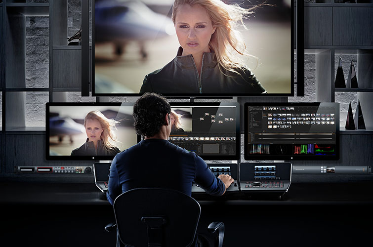
Color grading is an art form that can take years to master. I have been doing it professionally for four years now and I’m still learning new techniques every day and developing my skill set as much as I ever have. This is largely thanks to the fact that I now work on such a wide variety of projects that all call for such different looks. But with all that I have learned over the years, some of the most important lessons have come from color grading commercials.
Oddly enough, commercials often require the most amount of color grading even if the source footage looks beautiful to begin with. To put this in perspective, consider what would be required to color grade a feature length narrative film.
Often there is a short timeline (maybe a few weeks) to color grade hundreds or thousands of shots, and artistically there is a lot of freedom in terms of where things can go. This means that in many cases the rules are easier to break when coloring a feature (within reason) and each shot gets less attention than a commercial, since there are so many other shots that you need to get to.
Commercials are the exact opposite. A 30 second commercial may only consist of a dozen or so shots, but can still take a couple of days to grade. This is because: A) Commercial budgets can usually afford more time in the color suite, and B) More specific grading often needs to be done.
So when you break down how much time is actually being spent on any given shot, a commercial project will always have a much greater number than a feature film. Commercials can be one of the hardest types of projects to grade for this reason, and in order to achieve great results, you need to be aware of some key fundamentals.
So for those out there that do a lot of commercial work, the tips below are for you. Please know that there are of course exceptions to every rule, and these tips certainly do not apply to every single commercial. That said, they will be relevant for the majority of commercial spots you might be working on.
1. It’s All in the Midtones

As far as color is concerned, commercials are all about the midtones. This is especially true of commercials that feature talent and aren’t simply a montage of product shots. In a narrative film, it’s perfectly okay (or in some cases even encouraged) to place mid tones/skin tones in a unique place.
For instance, you might be creating a really moody scene and want your actor’s faces to be underexposed, and you might achieve that by bringing down your midtones significantly… But on a commercial project you would almost never do this.
Commercials almost always benefit most from accurate, neutral, and pleasing midtones that are a touch on the bright side. Since the talent in any given commercial is essentially there to sell a product (even if the commercial isn’t pitchy), their appearance needs to be inviting and attractive, and the first step in achieving that look is by color correcting the mid tones in a way that brings up your talent’s skin to an optimal point.
2. Use Power Windows
Most commercial projects use far more power windows than their feature film counterparts. This isn’t because the commercials need to be more stylized (more on that below), but rather because details are extremely important in any commercial project.
For example, the color of a can of soda might need to be keyed and windowed to match exactly with the actual color approved by the brand or agency. Also, certain elements of people, products, or environments may need to be highlighted or brought down in order to draw the viewer’s attention to the right place.
There is so little time to tell a story in a commercial, and the format is so highly visual that every last detail and shot becomes very important. Power windows are one of the best tools that you can use to achieve these results, but you always want to make sure to use them within reason. You don’t want your final product to look like it has windows all over it… It needs to look and feel natural, and just accentuate the most important parts of the frame without getting distracting.
Here’s a video from F-Stop Academy that covers working with power windows.
3. Never over-stylize

Many amateur colorists that come from an independent film background make the mistake of over-stylizing their commercial grades. This is often because they are so used to working with directors (possibly on genre films) that ask them to go really extreme with their grading, that they are almost programmed to push things really far in the color suite.
In reality, most commercial projects need more color correction than color grading. In other words, a well-shot commercial should look great out of the can, and might not need a heavy look on it.
Usually just applying a LUT, balancing your shots, and matching everything gets you most of the way there. Once your power windows are added, you are probably 90% finished. At the very end, you might want to add just a touch of a look (warmer, cooler, etc.). Once again, there are cases where you need to break this rule, but more often than not, neutral and accurate works best for commercials.
Author: Noam Kroll
Sources: Article